Xyne Code · Designing the conversation layer for a desktop coding agent
A desktop app for a coding agent, designed around your attention rather than the chat window
Role
Design lead · Interaction and visual design
Stack
Electron · React · TypeScript · Tailwind
Why build this at all
Codex, Claude Code and Cursor already have good desktop clients. Xyne Code exists because of where the work runs, not how it looks. Frontier apps get expensive at company scale, and they send code to someone else's model. Xyne is Juspay's open-source enterprise AI platform. Xyne Code runs on glm-latest, an open model we host ourselves.
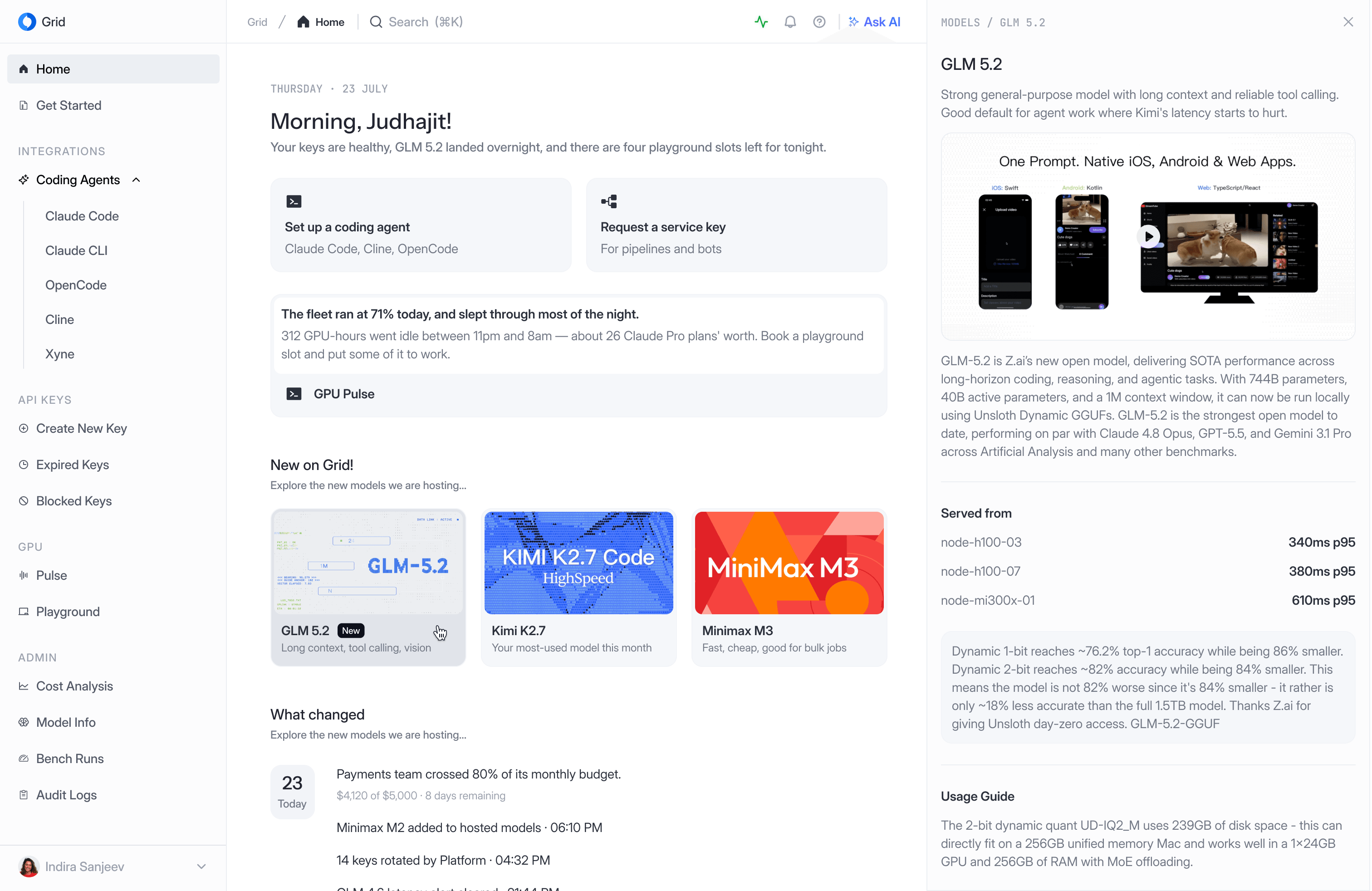 Related case studyGrid DashboardThe control plane for our self-hosted models: keys, usage and budgets
Every request it makes goes through Grid, Juspay's AI gateway. Grid routes it to the models we run, issues the keys, and tracks spend against each team's budget. So a long agent session isn't a hidden cost; it shows up in Grid, where someone can see it and cap it. I designed Grid's dashboard too, so this is where the two pieces of work meet.
That choice shapes the design. A self-hosted model is a different collaborator from a frontier one, so I couldn't copy another app's defaults wholesale. Each default had to follow what our agent can actually do.
The unit is the turn, not the message
Every coding agent app looks like a chat window, so the obvious brief was “design a chat.” I think that brief is wrong. In a chat, the unit is the message. Here it's the turn: one request, then minutes of thinking, reading, editing and testing before the reply. Show all of it and people stop reading. Hide it and people stop trusting it.
Agent time is cheap; human attention isn't. So every decision below answers one question: does this need the person's judgment right now? If it does, ask clearly. If it doesn't, keep it one click away and out of sight.
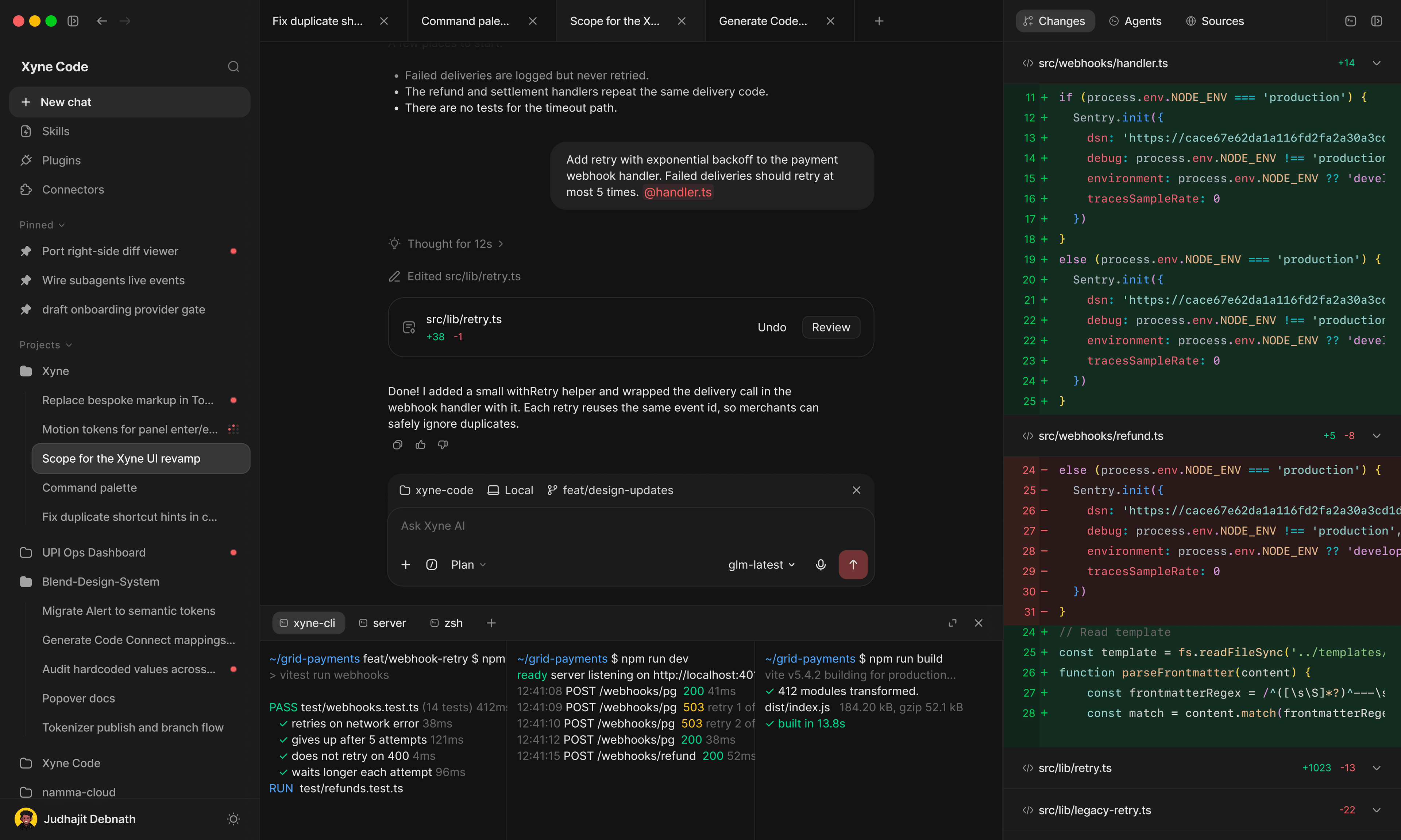
Progress folds away once it's done
While a phase is live it gets its own line and a running timer, so you can tell the agent is working and for how long. When the phase ends it folds into one line. “Exploring 4 files, 2 searches” becomes “Explored 4 files, 2 searches.” The change of tense is the status.
The composer starts in the middle of an empty window and drops to the bottom once the conversation starts. Project, machine and branch sit on the composer itself, so you know where the agent will act before you send anything.
The thread keeps the summary. Panels keep the proof.
When the agent changes a file, it doesn't describe the change in prose. It posts a card: the file, lines added and removed, Undo and Review. Review opens the full diff beside the thread. The terminal works the same way. The agent says the tests pass, and the terminal underneath shows them passing.
Both panels are closed by default, and opening one narrows the thread instead of covering it. The conversation never disappears behind its own evidence.
The plan isn't part of the conversation
In plan mode the agent writes a checklist before it touches code. That could have been another message. It isn't, because a message scrolls away and a plan has to stay in view while the work happens. It docks above the composer and updates in place. Finished steps are struck through, the current one spins, the rest wait.
Typing while the agent works
This is the interaction a coding agent gets wrong most often, and the one the static frames didn't cover. You notice something mid-turn and start typing. What should Enter do?
Enter queues. The message waits under the live turn, visibly not sent yet, and goes out when the turn ends. ⌘Enter sends it now and steers the current turn. The send button becomes Stop whenever the agent is working, so stopping never takes a hunt. A stopped turn says how far it got and what it did or didn't change.
This is the opposite of where Codex landed. Codex started with Enter queuing, then made steering the default once its model could take an instruction mid-turn without losing its work. I think that's the right lesson, and it cuts both ways: the default should follow the model. Ours hasn't been tested on mid-turn instructions yet, so queuing is the safe default today. The steer-versus-queue signal below decides when to flip it.
Presence, across every conversation
People run several agent sessions and only look at one. The sidebar is where the others report back, in three states. A pulsing mark means working. A quiet grey dot means finished. A red dot means waiting on you.
Only red is allowed to interrupt you outside this list: a dock badge, or a system notification. An agent that finished can wait for you to come back. An agent that's blocked on you is wasting time, and that is what an interruption should be for.
Tabs are the working set. The sidebar is the archive.
Running more than one agent turns the sidebar into a switchboard. Every switch meant scanning a tree of projects and pinned chats. And opening a chat replaced the one you were in, taking your scroll position and your unsent draft with it.
Tabs hold the few sessions you're actively running. Each tab keeps its own place in the thread and its own draft. Each one also carries the same presence mark as the sidebar, so a session that finishes or gets stuck in the background shows up where you're already looking. Collapse the sidebar and the tabs are all the navigation left, which is enough for most of a working session.
Built as parts, not screens
Xyne doesn't have a design system yet, and I'm building it alongside this app. So every pattern above was designed as a part with states, not as a screen, and each one had to work in at least three places before I'd call it done.
How I'll know it works
Nothing here has reached enough people to report results. So these are targets, set before launch, each with what changes if we miss it. I'm writing the threshold down first so I can't read success into whatever comes back. Usage comes from client events; cost comes from Grid.
Kept changes per hour of attention
Edits that survive review and aren't undone within a day, divided by the time the window is actually in focus. It rewards the agent for doing more and the interface for asking less. It also punishes both for work that gets thrown away. It's paired with cost per kept change from Grid, which should stay flat or fall as usage grows.
Baseline · The same measure on xyne-cli, for two weeks before launch
Target · Above the CLI baseline within the first month
Fold reopen rate
Share of turns where someone expands a folded line.
Target · Under 20% of turns
If missed · Above 40%, the last phase of each turn stays unfolded by default
Steer share
Of the messages sent mid-turn, the share sent with ⌘Enter.
Target · Under 50%
If missed · Over 50% for two weeks, and the model passes the steering test below, Enter switches to steer
Time to answer an approval
Median time from an approval card appearing to an answer, when that chat isn't open.
Target · Under 2 minutes
If missed · Over 10 minutes means the notification isn't reaching people. Test a stronger alert, for approvals only
Revert rate
Share of kept edits reverted within a day, read alongside how often cards are opened in Review.
Target · Under 10%
If missed · Rising reverts with falling reviews means trusting the card is too easy. Put the diff summary on the card itself
What's still open
Each open question has a way to close it.
- Every decision here is reasoned, not observed, so the first five internal users over two weeks settle it against the CLI baseline.
- Whether our model can take an instruction halfway through an edit without losing work is answered by a steering test on glm-latest: 50 scripted turns with an instruction injected mid-edit, and Enter steers only if the work survives in at least 45.
- Whether this is standalone or lives inside Xyne changes the navigation, and where sessions start in the first month decides it.
- How a parent turn shows several children running at once is the next piece of design work.
A coding agent spends most of its time working while you wait. The design is mostly about what you see during that wait, and when it’s allowed to interrupt you.