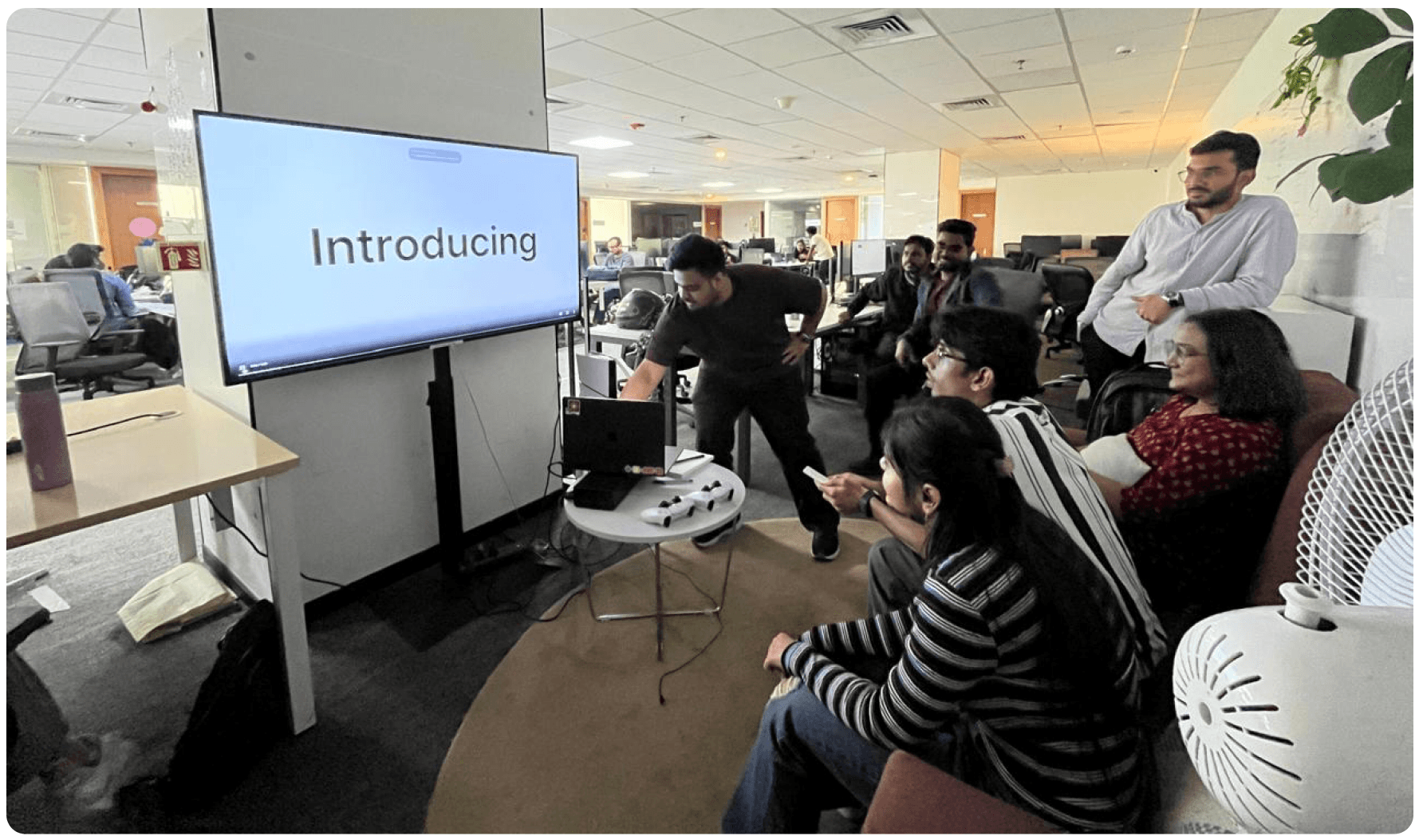
Blend Design System
Building and Scaling an AI-Powered Design System Ecosystem
Role
Product Designer
Duration
6 months, now in maintenance mode, and bug fixes...
In one year, a small team of five turned a fragmented dashboard ecosystem into a self-sustaining design system - one that measures its own adoption, teaches AI to generate from itself, and gives teams the freedom to make it their own without breaking it.
This is the story of Blend: Juspay’s design system. Not just the components, but the ecosystem of tools, platforms, and infrastructure built around it. From the first token to the MCP server, from driving adoption to getting featured by Figma.
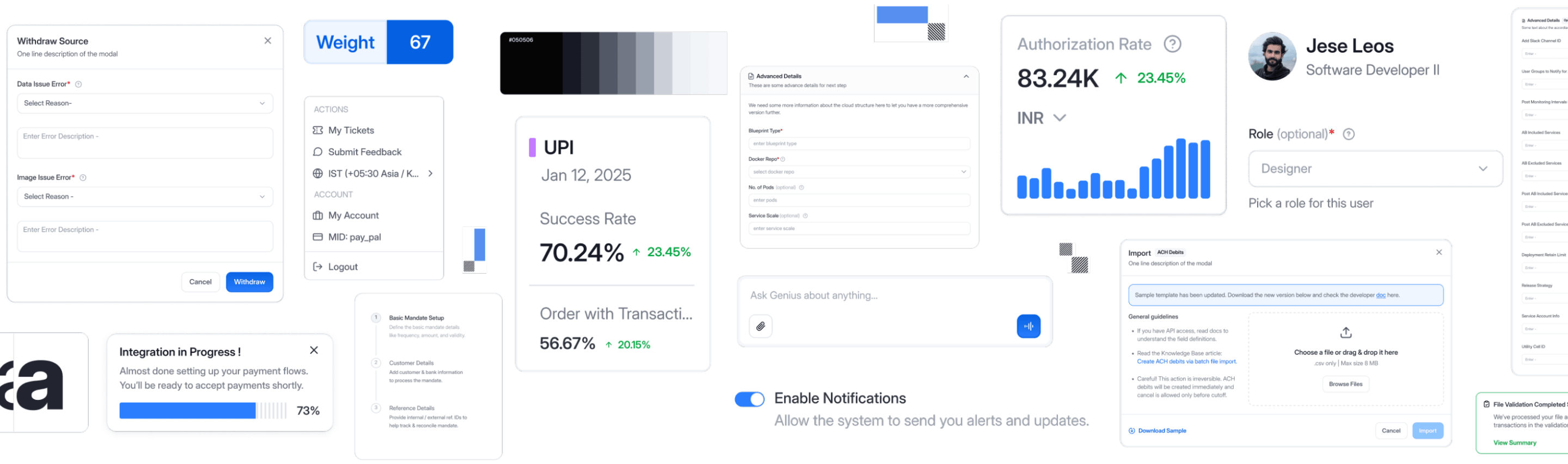
Eight dashboards. Eight different ways to build a table.
At Juspay, the merchant dashboards had grown up separately. Euler, UPI, Offers, Recon, HyperSwitch, a few more. Each one solved a real problem. Together they read like eight different products from eight different companies. A table in one didn't behave like a table in another. Forms followed different rules.
We treated this as a visual consistency problem for a long time. It wasn't.
Designers rebuilt the same dropdown every quarter. Devs re-coded it. PMs quietly padded every estimate. Nobody owned the cost, so nobody saw it.
Fragmentation never shows up as a design problem. It shows up as a delivery problem.
8+
Independent dashboards
17%
Component detachment rate
15-20%
Visual inconsistency across products
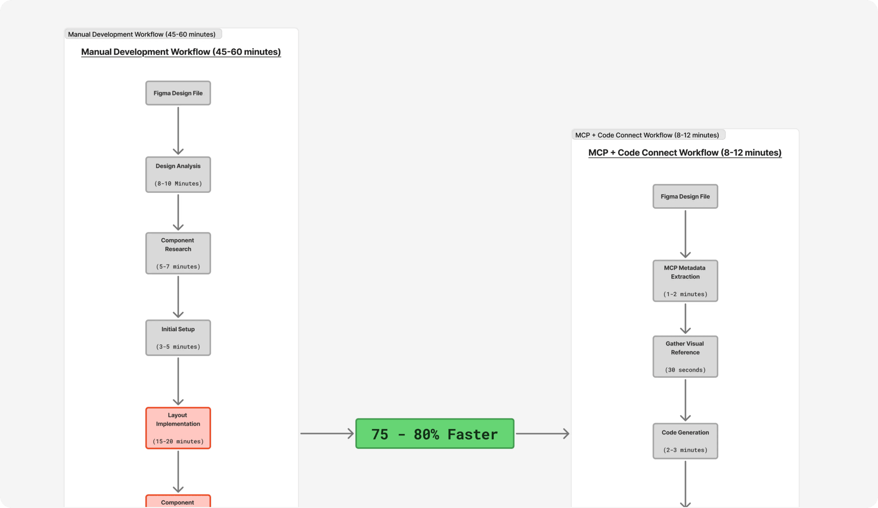
45-60 min
To build one screen
featured by Figma
From design to code:
How Juspay achieved 5x faster workflows with Figma
Juspay, a leading multi-national payments technology company, relies on a fast-moving, engineering-first culture to support millions of transactions across complex merchant and consumer ecosystems. With dozens of dashboards, modular platforms, and extensive customization requirements, design had to evolve from manual effort to a scalable, developer-aligned system.
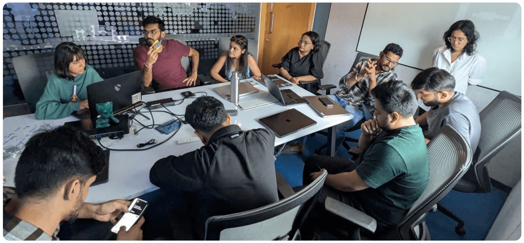
We stopped designing screens and started designing a vocabulary.
The fix wasn't a guideline doc. We built Blend as a product, not an asset: foundations → atoms → molecules, with one hard rule - every component consumes foundations only, nothing else.
The real unlock was tokens. One naming structure that read identically in Figma and in code: component, target, CSS property, size, variant, state.
Once designers and devs were naming the same thing the same way, parity stopped being a review step and became the default state. It's boring work. It's also the highest-leverage thing we did all year.
Consistency you have to enforce isn't consistency. It's supervision.
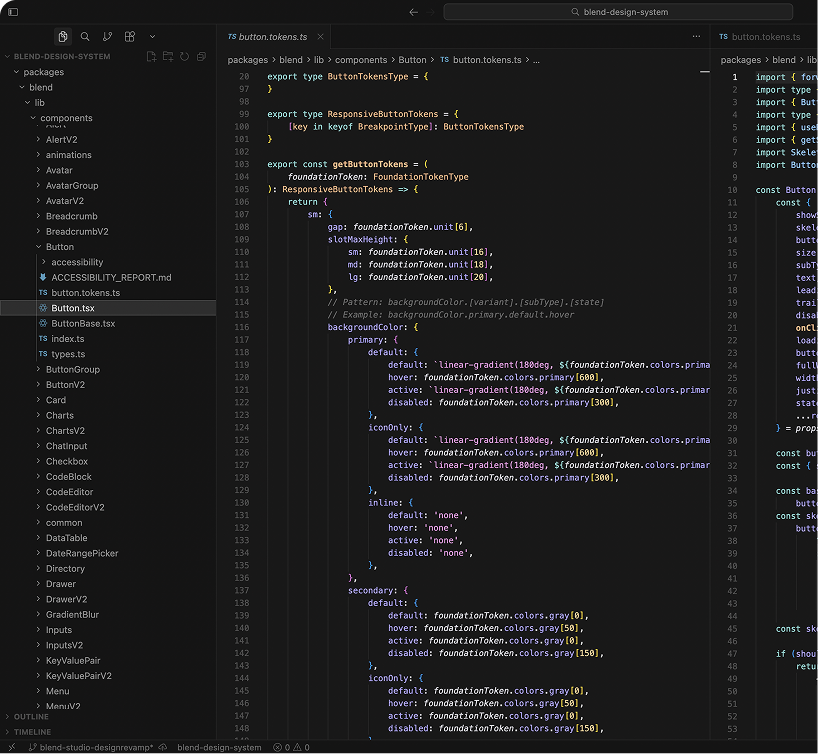
Tokenization in code
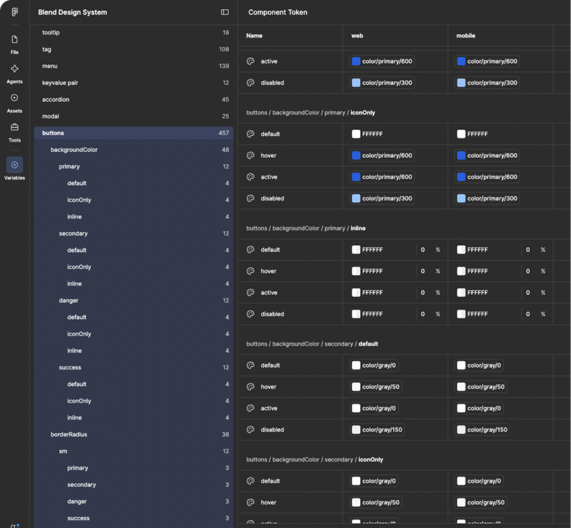
Tokenization in Figma
Two weeks after launch, adoption was zero. That was the actual project.
v1 shipped. NPM published, Figma library live, nothing broken. Nobody used it.
Seven teams, seven roadmaps, three objections that came up every single time: our components work fine, we can't spare the sprint, and from the largest dashboard your library is TypeScript and our codebase is ReScript.
We never mandated it. We went after the hardest team first instead. Euler wrote their own ReScript bindings, swapped components one at a time, and didn't touch a single layout. Once it shipped, the other six stopped needing convincing.
Win the hardest team first and everyone else's objection loses its weight.
The migration numbers flatlined. The teams weren't the problem. We were.
A few weeks in, the graph went flat.
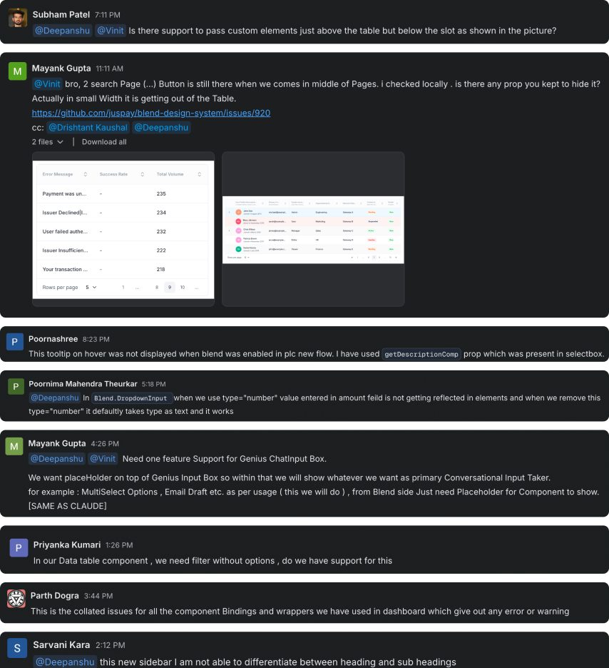
Teams had started writing local wrappers for anything Blend didn't cover yet. Sensible from where they sat. From where we sat, it was the exact fragmentation we'd set out to kill.
The instinct was to write a policy. We didn't. The wrappers existed because our component pipeline was slower than their sprints - that's a supply problem, not a compliance problem. We pulled more people onto the remaining components and shipped faster. The wrappers stopped appearing on their own.
We got very good at shipping fast. Then we got very good at fixing the bug.
Adoption worked, so requests piled up. Three devs, a Slack-driven queue, no tracking, no priority. Fixes landed in hours and broke something else a fortnight later. The same prop was leftIcon in one component and leftSlot in another. Learning one component taught you nothing about the next.
So we built a real pipeline. GitHub issue → assignment → local test → beta → QA → stable, with commit hooks and CI gates nothing could skip.
It genuinely slowed every individual release. That's the trade. We stopped going backwards, so the total went down.
Process feels like drag right up until you count the hours you spend re-fixing.
MCP Server - Teaching AI to Speak Blend
The problem? A developer used Cursor to scaffold a new settings page. Clean, well-structured React code - using exactly zero Blend components. The AI had no idea Blend existed.
An MCP (Model Context Protocol) server - published as blend-ui-mcp - that exposes Blend's entire component catalog as structured tools any AI assistant can call. 11 tools covering component discovery, prop lookup, variant inspection, usage validation, design token retrieval, documentation generation, and full section scaffolding.
When a developer asks Cursor or Claude to "build a data table with sortable columns and pagination," the AI calls the MCP server, discovers that Blend has a DataTable with sortable and paginated props, and generates code that is Blend-native from the first keystroke. It even catches mistakes: a validate_component_usage tool fuzzy-matches typos like typ → buttonType before the code is even written.
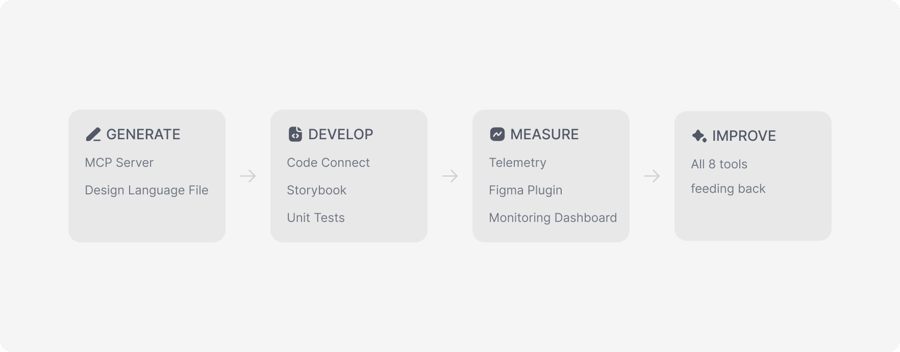
Code Connect surfaces the exact props from Figma Dev Mode - no guessing, no tab-switching.
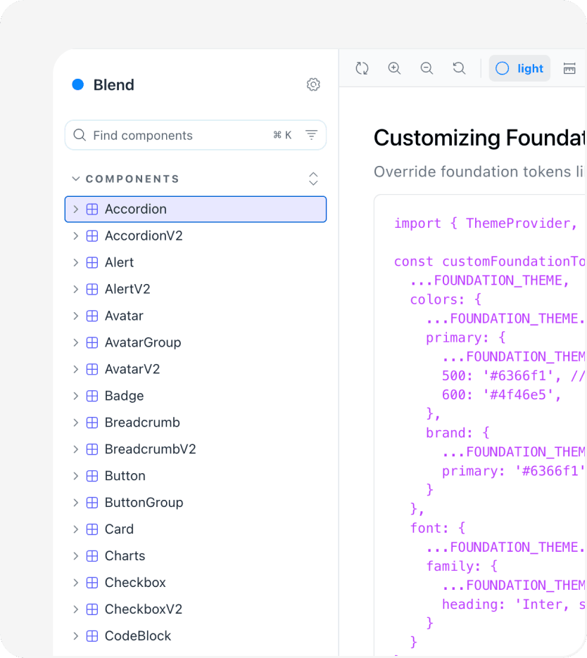
Storybook
Connected to the System
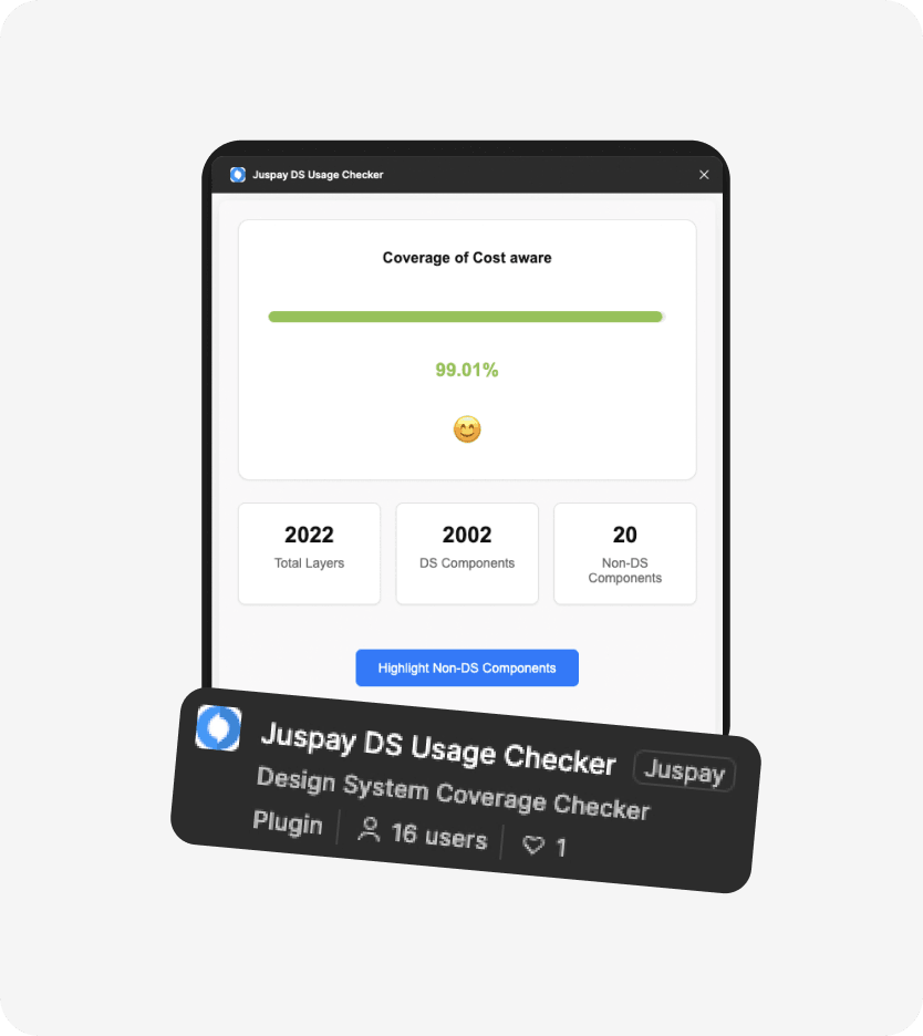
Figma Plugin
Measuring Design-Level Adoption
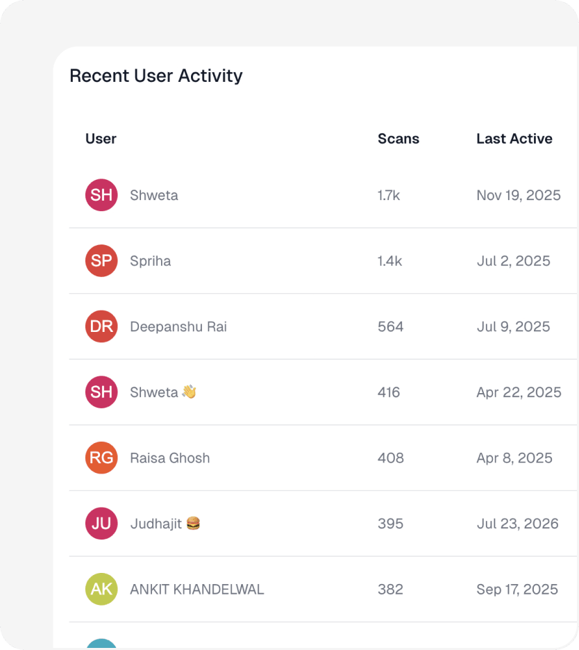
Blend Monitor Dashboard
One Screen for Everything
Everyone wanted Blend. Nobody wanted to look like everyone else.
The more consistent the system got, the harder teams pushed back on it. Different products, different audiences, different brands. Fair.
Before we had an answer, they hardcoded hex values straight into their projects. Snowflakes that looked like Blend and maintained like nothing.
So we borrowed a model everyone already understood: Git. Branch the tokens. Edit with live preview. Diff it against production on real components. Get a reviewer from your own team to approve - not us. Publish.
Colors, type, spacing, radii, shadows. The whole language, not a paint job.
Freedom inside structure. Give teams less and they'll route around you.
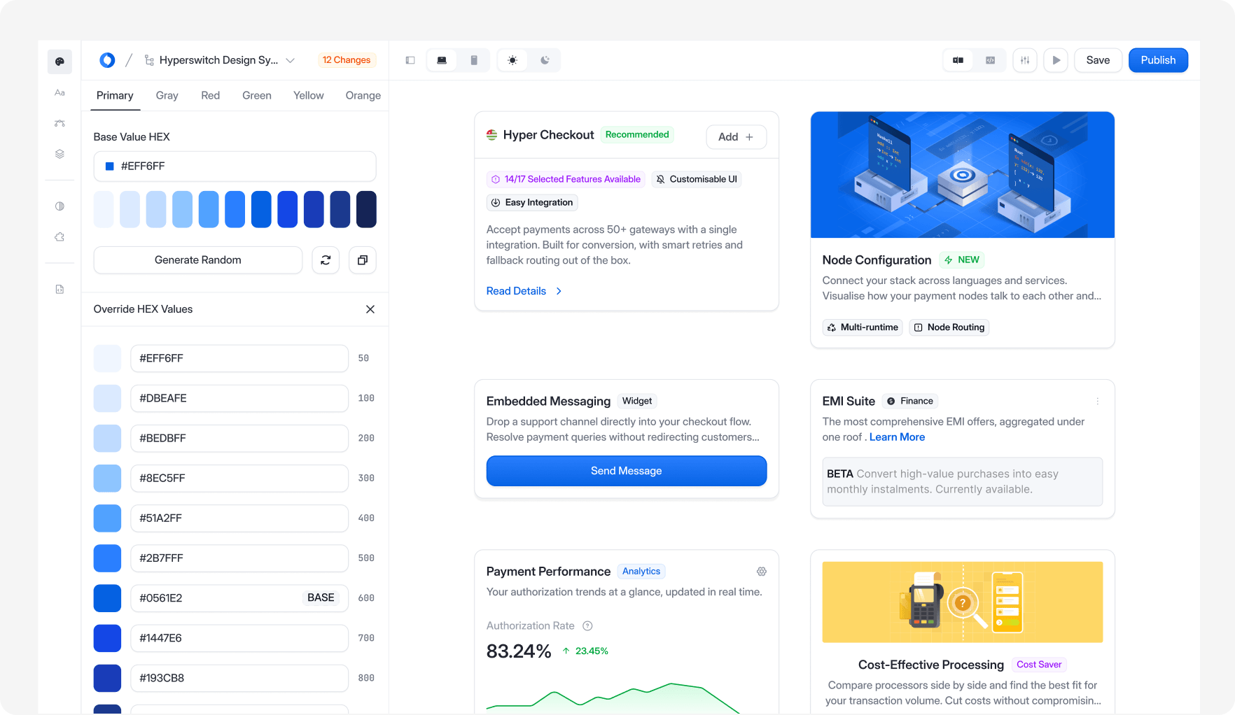
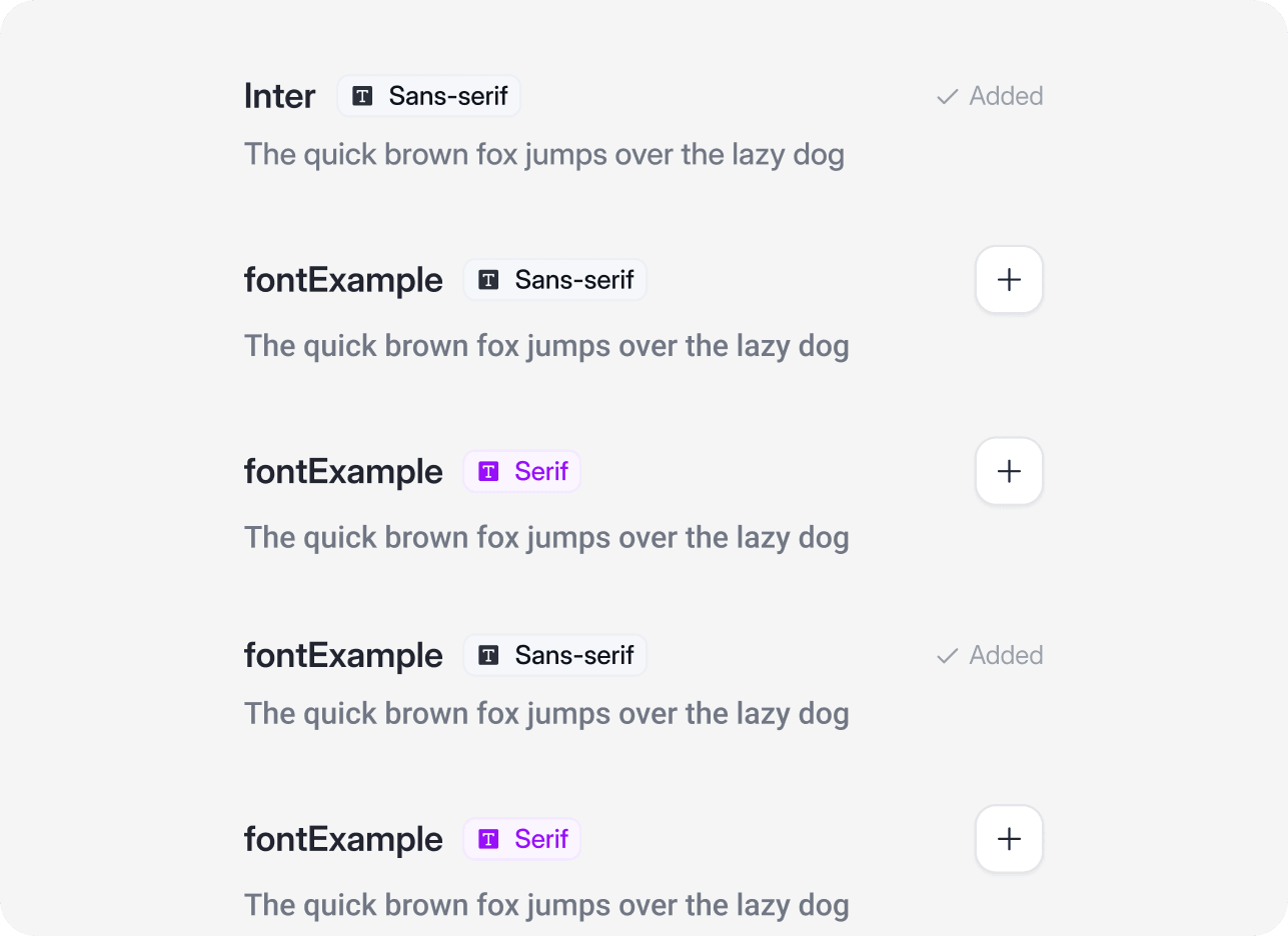
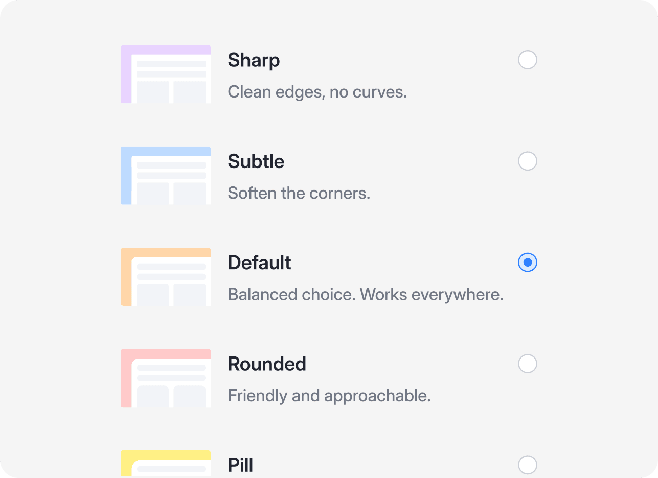
Typography and corner-radius tokens, exposed as per-brand overrides.
Build the infrastructure that makes the system smarter, not just the parts that make it bigger.
A year in, the thing I'm proudest of isn't the components. It's that Blend measures itself, teaches AI to use itself, and lets teams make it theirs without breaking it.
You don't ship a system and move on. You build it, feed it data, give it a way to see itself, and then get out of its way.
5x
Design speed improvement
173%
Increase in component reuse
17%
Drop in detachment
71%
Average system coverage